


Redesign is a necessary part of having a news website. The process can be lengthy and costly and there’s always some risk involved – will the audience engage with and like the redesigned look? The Center for Media Engagement wanted to test whether online experiments could help news organizations learn more about what their audience wants when going through a redesign.
The results show that an online experiment can pick up on many of the same signals as a full deployment of a site redesign. To the extent that these findings continue to replicate, doing an online experiment would provide news organizations with a relatively inexpensive way to test out redesigns before embarking on a full launch.
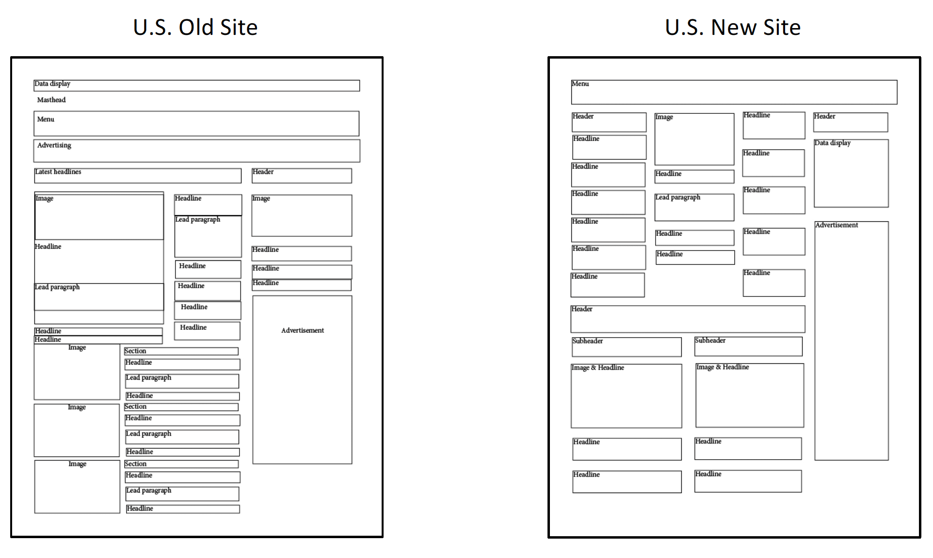
To do this work, we partnered with a major Canadian news organization and a major U.S. news organization, both undergoing a redesign of their homepage. We conducted two online experiments, one with 938 Canadian adults and one with 987 U.S. adults. In both studies, participants were randomly shown either an old version of the news site or a redesigned version of the site and then asked questions about their perceptions of the site and what they recalled. Skeletal layouts of the old and redesigned sites are shown on subsequent pages.
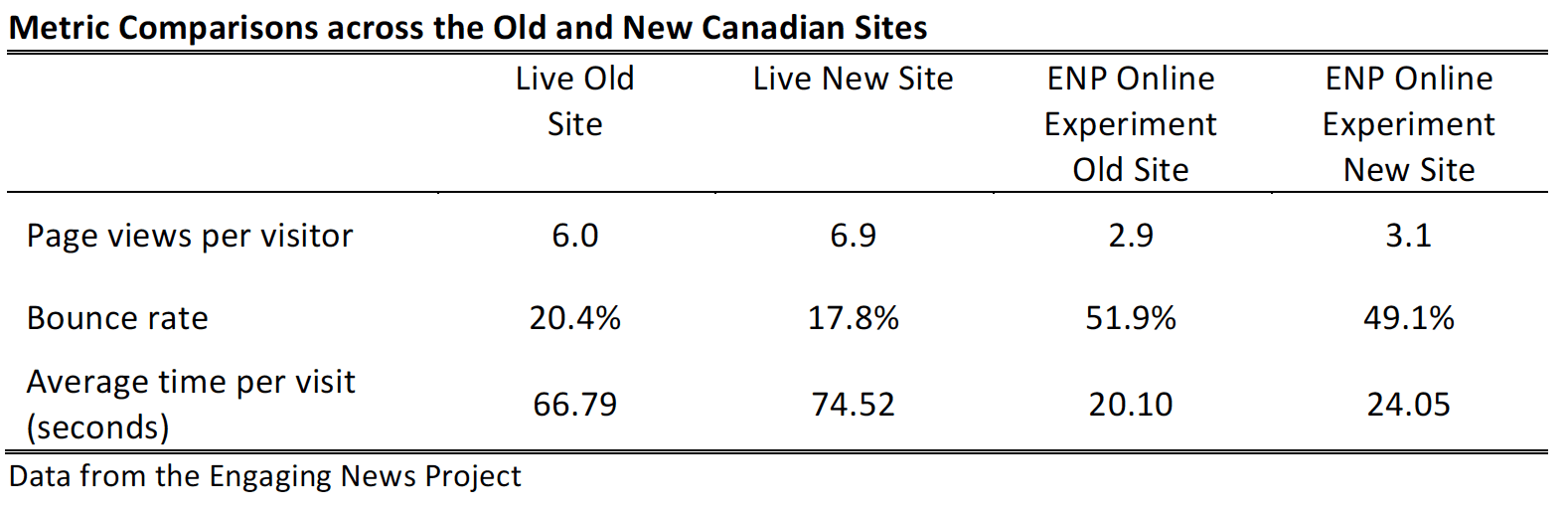
At exactly the same time that we conducted our online experiment, the Canadian newsroom randomly showed around 8,000 people visiting their website the new version of the homepage. This allowed us to compare the results we were seeing from the online study to the results that the news organization saw from its audience.
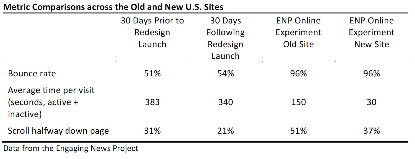
The U.S. newsroom launched its redesign approximately three months before our online experiment. We examined whether the metrics resulting from our online experiment matched the newsroom’s internal metrics before and after they launched their redesign.
Key Findings
Study findings include:
- For the Canadian redesign, page views and time on page were higher on the new site compared to the old site.
- For the U.S. redesign, the bounce rate increased and the average time per visit and the number scrolling halfway down the page declined on the new site compared to the old site.
- We compared the results from the live, real-world experiences of the Canadian and U.S. news organizations to the data that we gathered via our online experiment.
- Overall, those visiting the site via the online experiment were less engaged than those visiting the site on their own. They spent less time and viewed fewer pages.
- Despite this, the differences across the old and new sites were similar for nearly all metrics. For example, the new Canadian site yielded more page views per visitor than the old site. This difference appears in our online experiment and via the news organization’s real-world experience.
- For the Canadian site, article recall was higher for the new site than the old site. There were no significant differences in article recall across the U.S. sites.
- There were differences in which articles were recalled on both the U.S. and Canadian sites. Some articles were better recalled on the new site, and others better recalled on the old site. Differences in recall corresponded with the presence of images and where the articles were placed on the page.
- When our Canadian respondents were asked about the function of the hamburger menu button, 54.9% correctly identified the purpose of the button.
- Differences appeared across the old and new sites in both countries regarding how people rated the site, and the features they liked most and least.
Implications for Newsrooms
Different website designs can elicit different user experiences and influence what people recall. Results of our analysis across two distinct news sites, with audiences spanning both Canada and the U.S., reveal distinctions between the old and new site designs, with some aspects preferred on the old design and others on the new design. Site design can affect metrics like page views and time on site, but results can vary. Testing can help news organizations find out if their redesign plans will achieve the desired results.
The studies showed consistent patterns regarding which articles were better recalled. Articles that were accompanied by a picture, that required less scrolling, and that were in left-most columns tended to be better recalled.
We also demonstrated mixed levels of knowledge about the hamburger menu among Canadian respondents (we didn’t evaluate this in the U.S. sample) – those who are younger and who use mobile phones for news were particularly likely to understand the meaning of the button.
There are two important broader implications of these results. First, this research shows that an online experiment can yield valuable insights for a newsroom undergoing a redesign. Compared to the costs associated with redesigning a website, doing an online experiment is a relatively inexpensive way to get feedback before launching a full redesign. It could even be a way to systematically test different variations of a website.
Second, the two news organizations involved in this study incorporated elements of contemporary design to different degrees. Contemporary design, as the Center for Media Engagement investigated in a previous report, involves more images, less text, and content displayed less hierarchically. In our previous research, we similarly found that contemporary site designs led to more page views and greater article recall.1 The Canadian site in this study incorporated more of these elements, particularly toward the top of the homepage, compared to the U.S. site. It is noteworthy that the Canadian site also saw an increase in page views and recall, while the U.S. site did not. That our earlier findings receive some support in a live test continues to suggest that site design is particularly important in how visitors navigate a site and recall information from it.
The Study
The Canadian sites differed primarily in the number of photos and the amount of text featured on the homepage. The redesigned site included more photos and less text compared to the existing version. The new site eliminated the old site’s longer descriptions for stories placed at the top third of the page, and instead used a grid-like organization displaying a photo for each story in the upper and middle thirds of the page. The bottom one-third of the new site featured nine sections labeled by topic, displaying a main photo for each section. These replaced the old site’s 20 sections, which contained no photo for each section.
The U.S. sites differed most notably in page width, prominence of photos, and amount of content. The new site featured a wider design and more vertical content. The old site had a narrower design, smaller photos, and required less scrolling. The new site had fewer photos at the top of the page, but larger photos after scrolling, compared to the old site.
Here are skeletal layouts of the changes at the Canadian and U.S. websites:

Live Site Tests Match Experimental Tests for Most Metrics
We compared the results of the tests we conducted as part of our online experiments to the traffic data collected by the sites regarding their redesigns. For most metrics, the results were similar.
For the Canadian redesign, results favored the new site. In both the live test and the online experiment, the new site generated more page views per visitor, a lower bounce rate, and higher average time per visit. To make this comparison, just over sixteen thousand people visiting the homepage were randomly assigned to view either the existing homepage or the new, redesigned homepage. This took place at exactly the same time that we launched our experiment, making this comparison quite strong.
Although the direction of the results is similar, those visiting the site on their own seemed to be more invested than those directed to the site through our experiment. Those visiting the live site naturally spent more time compared to those visiting the site experimentally.
For the U.S.-based news organization, the results favored the old site. As seen in the table below, the new site had a higher bounce rate, lower time on page, and shorter scroll depth in comparison to the old site. These results are in evidence for both datasets, with the exception of the bounce rate, which was identical across both sites in the online experiment. To obtain these metrics, the U.S. news organization provided us with data for 30 days prior to, and 30 days following, the launch of their redesign. Because traffic data can vary by month for reasons other than the redesign, this is a less stringent test.
Those accessing the site as part of the experiment spent less time and had a higher bounce rate than those accessing the site of their own accord. Those accessing the site experimentally were more likely to scroll halfway down the page, but this may be due to the website being embedded within an experiment.
Which Articles Recalled Varies by Site
Study participants were asked to list up to 10 articles that they could recall from the site. We coded all responses for whether the identified article appeared on the site.2
For the Canadian website, those using the new site recalled more articles than those using the old site.3 For the U.S. website, there were no differences across the two sites.

We analyzed whether differences in recall across the old and new sites varied depending on people’s age and their previous experience with the news organization’s site.4 Similar differences in article recall appeared regardless of study participants’ age or previous experience with the news organizations’ websites.
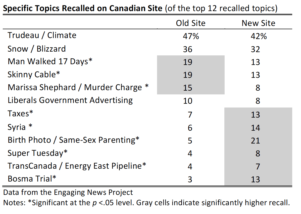
Across the two sites, there were differences in which specific articles people recalled. The top twelve articles mentioned by Canadian participants are included in the table below. Three of the articles were recalled more on the old site than the new.5 Six articles were recalled more on the new site than the old.6
Based on these results, we went back to the screen captures that we had obtained throughout the data collection period to understand what might account for the differences. We looked at screen captures of the site at five different time points. For each story, we coded where it appeared on the homepage and whether it had a photo.
Several explanations seem plausible from an inspection of where the article appeared:
- Pictures increase recall. Six articles were recalled more frequently on the new site than the old one. In 28 of 30 observations (6 articles across 5 different time periods), these articles were accompanied by a picture on the new site, but not on the old site.
- No differences in recall when articles equally prominent on the old and new sites. Three articles were recalled at a similar rate for both the old and new sites. In 12 out of 15 observations, the articles were equally prominent on both sites. The Trudeau article, for instance, appeared in the top third of the page, in the first column, and had a photo on both sites for all time periods analyzed.
- Column on the page affects recall. Three articles were recalled more frequently on the old site than the new one. It is more difficult to explain why these articles were recalled more frequently on the old site. The best explanation seems to be the column in which the story appeared. In nine of 15 instances, the old site had the article in the more prominent first column reading from left to right. In three instances, the story appeared in an equally prominent column. And in three instances, the pattern is the reverse, where the new site had the article in a more prominent column.
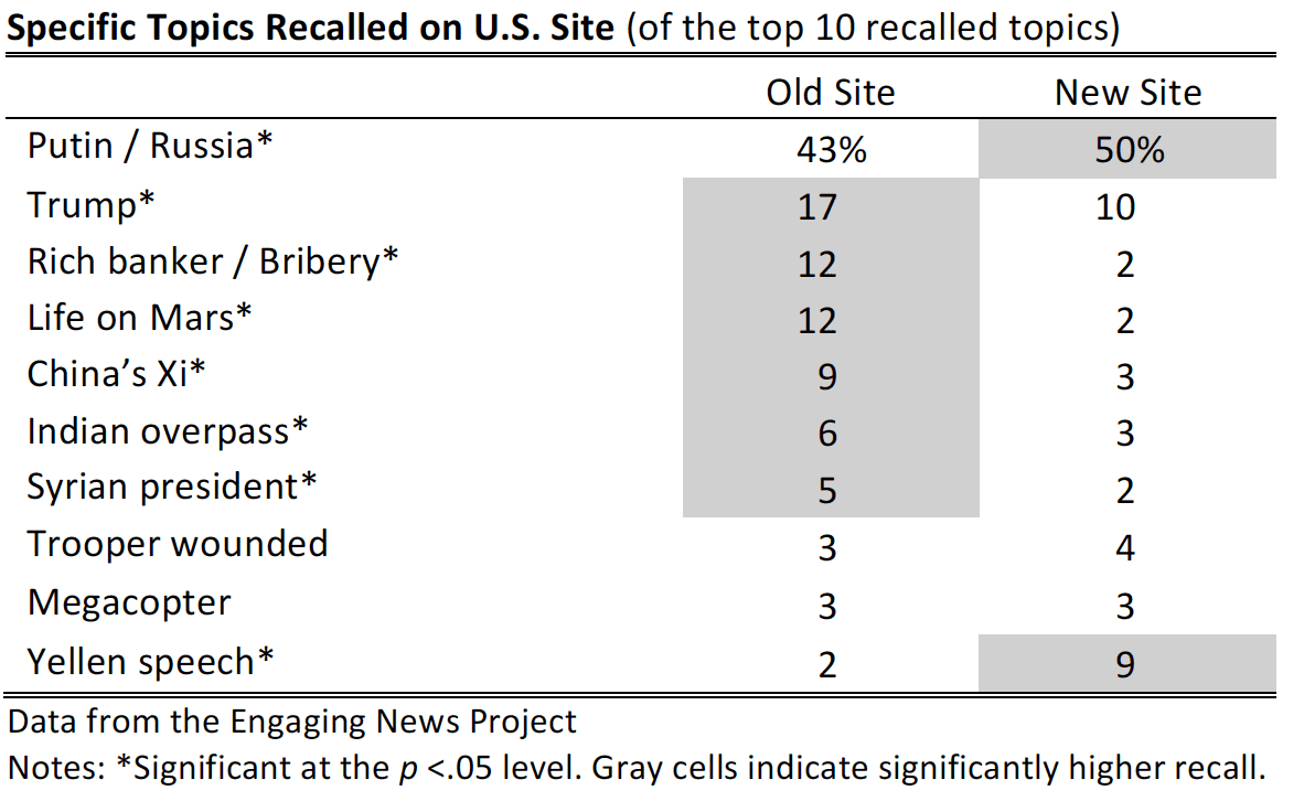
For the U.S. site, two of the top 10 articles were better recalled on the new site compared to the old site.7 Six were better recalled on the old site.8 We report the top 10 recalled topics, as opposed to the top 12 for Canada, due to the lower frequency with which stories mentioned.
As with the Canadian site, we went back to the U.S. sites and compared where each story appeared to understand these findings. Several explanations seem plausible from an inspection of where the article appeared:
- Pictures affect recall. The Putin article, better recalled on the new site, appeared with an image atop both the old and new sites. On the new site, however, there were no other images in the same row as the Putin story, while there was a competing image in the same row on the old site.
- The amount of scrolling matters. The Yellen article, better recalled on the new site, was featured at the top of the page on the new site, but was farther down the page on the old site. The rich banker, Indian overpass, and Syria stories required less scrolling on the old site compared to the new site. They also were better recalled on the old site.
- Column on the page affects recall. The Trump and China Xi stories, better recalled on the old site, appeared in a more left-hand column on the old site compared to the new.
- No differences in recall when articles equally prominent on the old and new sites. Just as we did on the Canadian site, we found on the U.S. site that the articles with no differences in recall (Trooper wounded, Megacopter) were similarly prioritized on the old and new sites.
Majority of Participants Recognize Function of Hamburger Menu

We asked the Canadian participants to identify the function of a hamburger menu button. Participant responses to this question varied considerably. Overall, 54.9% of respondents answered the question correctly while 45.1% either gave an incorrect answer or said that they did not know the answer.9
We also analyzed whether demographic or news-use habits predicted whether people correctly identified the meaning of the three lines indicating a hamburger menu.10 Younger individuals were more likely to identify the correct meaning of the menu, but education and gender had no effect. A 30-year- old had a 75% chance of knowing what the hamburger menu meant, while a 60-year-old had only a 34% chance.

Those who watched more television news or read a hard copy print newspaper more frequently in the past week were less likely to correctly identify the menu meaning. Those not watching television news had a 65% chance of correctly identifying the hamburger menu; those watching television news at least four times a week had a 57% chance. Similarly, those reading a newspaper at least four times a week had a 51% chance compared to those not reading a newspaper at all in the past week, who had a 62% chance of correctly identifying the menu.
Those who accessed a news website from their mobile phone were significantly more likely to know the meaning of the menu. Those accessing news on their phone around four times per week had a 66% chance of correctly stating the meaning of the hamburger menu; those not accessing a news website with their mobile phone had a 49% chance.
Differences in Most Liked and Least Liked Aspects of the Old and New Sites
Participants were asked to indicate which aspects of the site they most liked and most disliked. For most of the aspects that we evaluated, the responses were similar regardless of whether people browsed the old or the new site. A few differences did appear, however.
Most Liked Aspects
For the Canadian redesign, more people who browsed the old site said that they liked the amount of scrolling and how the site was organized than those who browsed the new site.11 Those who browsed the new site, however, were more likely to favor the text size and use of pictures than those who browsed the old site.12
For the U.S. redesign, more people who browsed the old site liked the use of pictures and the load time than those who browsed the new site.13
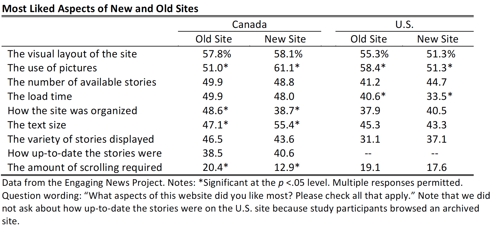
We analyzed whether the aspects selected as “most liked” varied by whether respondents had been to the news organization’s site in the past and how old participants were. For the Canadian redesign, a single difference emerged: Those who had visited the site in the past were more likely to say that they liked the visual layout of the new site (62%) compared to the old (54%). Those who had not visited the site in the past displayed the opposite pattern, preferring the visual layout of the old (62%) to the new site (55%).14
For the U.S. redesign, those who had been to the site before were more likely to say that they liked the text size on the new site (61%) compared to the old site (47%). Those who hadn’t been to the site before liked the text similarly across the two sites.15 Those who had been to the site before also were more likely to say that they liked the use of pictures more on the old site (66%) than the new site (45%). Again, those who had not visited the site before rated the old and new sites similarly.16
There were no significant differences based on participants’ age for either the Canadian or U.S. redesign.
Least Liked Aspects
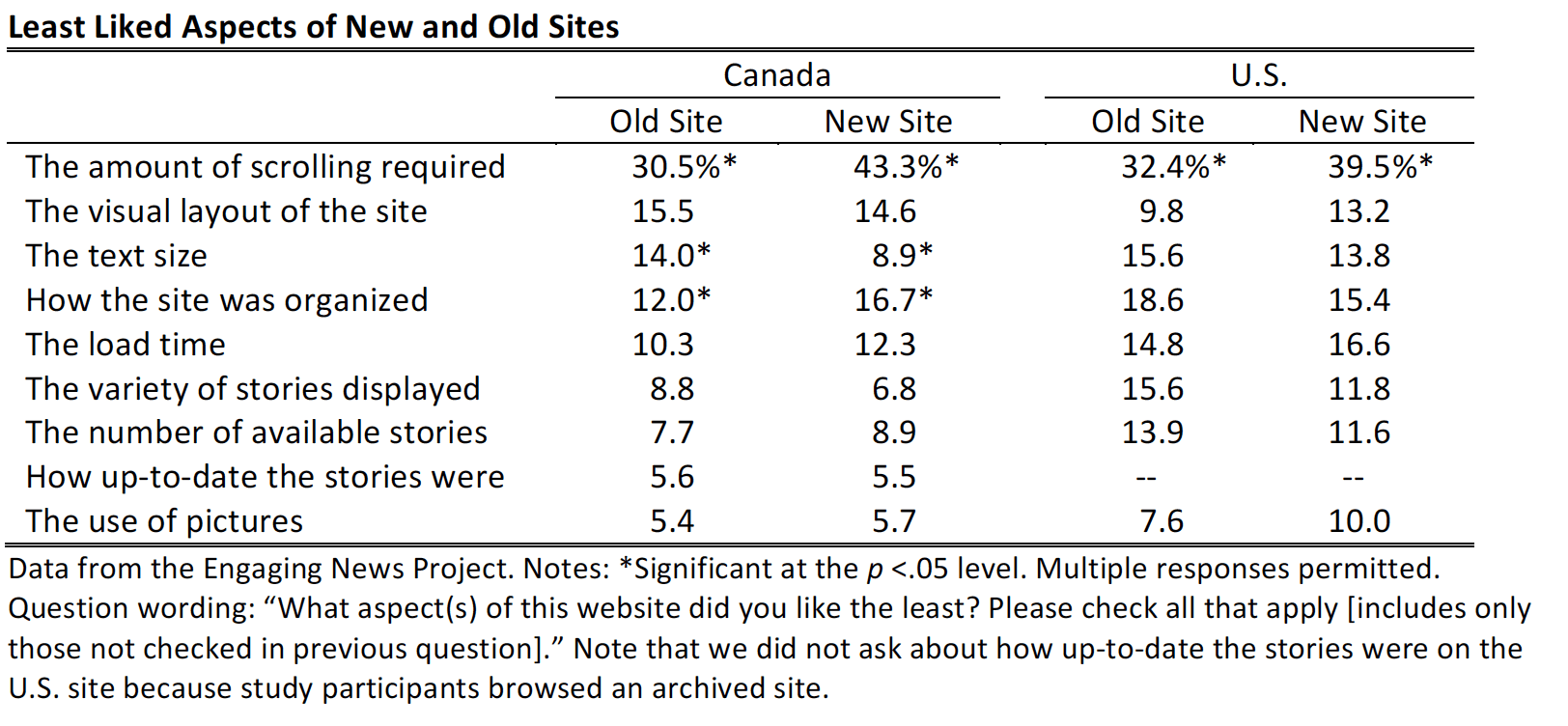
For the least liked features on the Canadian redesign, more participants browsing the old site reported that they disliked the text size compared to those browsing the new site.17 More participants who browsed the new site disliked how the site was organized and the amount of scrolling it required than those who browsed the old site.18
For the U.S. redesign, more participants browsing the new site reported that they disliked the amount of scrolling required than those browsing the old site.19 There were no other significant differences between participants who browsed the old site and those who browsed the new site in terms of least liked features.
When analyzing differences by age and previous use of the site, there were two differences for the U.S. redesign.
Those who had visited the U.S. site in the past were more likely to say that they disliked the number of stories available on the old site (23%) than on the new site (10%).20 Those who hadn’t been to the site before said that they disliked the number of stories at similar rates regardless of whether they saw the old or new site.
Second, younger U.S. respondents (those 18 to 29 years old) were more likely to say that they disliked the pictures on the old site than to say that they disliked the pictures on the new site; older respondents did not significantly differentiate between the two.21
There were no significant differences based on participants’ age or previous experience with the site in the least liked aspects for the Canadian redesign.
Old, New Site Ratings Vary Across U.S. and Canadian Sites
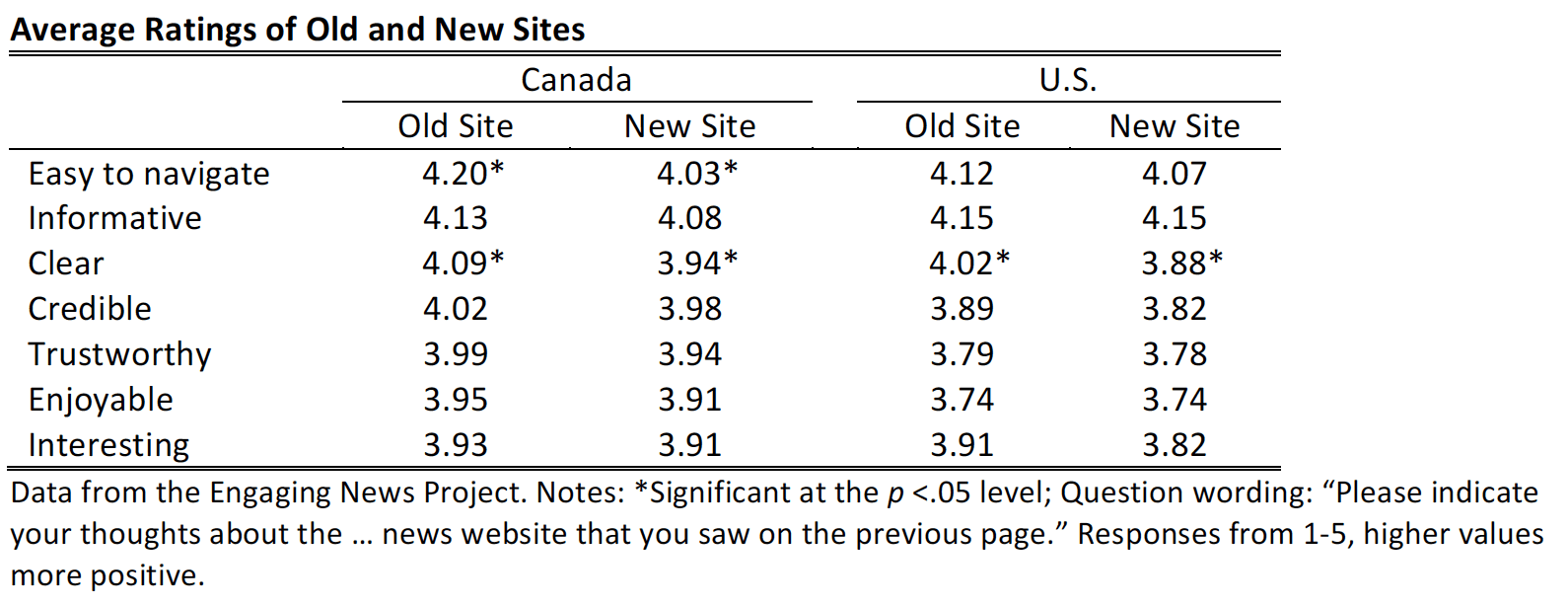
Overall, people rated both the old and new sites positively. Participants were asked to indicate what they thought of the website from 1 to 5, with 5 indicating a more positive response. For all attributes on both sites, the average ratings were positive.
Study participants tended to rate the sites similarly; there were no differences between the old and new sites in how enjoyable, interesting, informative, credible, and trustworthy participants found them.
There were several instances, however, where the old site fared better. Across both the Canadian and the U.S. sites, participants rated the older site design as clearer than the new site design. Across only the Canadian sites, participants also rated the older site design as easier to navigate than the new site design.22
We analyzed whether these findings differed depending on age or previous experience with the news website.
For the Canadian redesign, there was a single difference based on age. Young people, considered those aged 18 to 39, found the old site to be easier to navigate, rating it on average 4.13, compared to the new site, which they rated a 3.75 on average. Study participants aged 40 and above rated the old and new sites similarly in terms of how easy each was to navigate.23 No differences by age appeared in the U.S. data.
There were no differences in people’s impressions of the old and new sites depending on whether they had previously accessed the news website across both the Canadian and U.S. studies.
No Significant Differences in Visiting Again, Sharing, or Recommending
For both the old and new sites in Canada and the U.S., participants reported similar intentions to visit the site again, recommend the site to others, and share stories seen on the site.
Participants also rated the two sites similarly regardless of their age or previous experience with the news site.

Methodology
For both the Canadian and U.S. contexts, two concurrent studies occurred. The first was an online survey-based experiment and the second was a live test conducted by the news organization. We describe each in turn.
Online Survey Experiment
Canadian Redesign
On March 1-3, 2016, we conducted an online survey-based experiment to understand what people thought of two different versions of the news organization’s website. Respondents were recruited via the data-collection company Survey Sampling International (SSI), which administered the online survey to a nationwide sample of 938 Canadian adults.24 Respondents were required to be Canadians above the age of 18. We also required respondents to use a desktop or laptop computer because the news organization was only interested in testing the new site on desktop or laptop.
U.S Redesign
From July 26 to August 15, 2016, we conducted an online survey-based experiment to understand what people thought of two different versions of a news organization’s website. Respondents were recruited via the data-collection company Survey Sampling International (SSI), which administered the online survey to a nationwide sample of 987 U.S. adults.25 Respondents were required to be U.S. residents above the age of 18. We also required respondents to use a desktop or laptop computer because the news organization was only interested in testing the new site on desktop or laptop.
Sample Comparison
Although the respondents were not randomly selected, they were demographically diverse and representative in the sense that the demographics of the SSI panel members completing the studies were selected to match demographic targets of Internet users based on nationally representative, random sample surveys: the Pew Research Center’s Spring 2015 Global Attitudes survey for Canada and a Pew Research Center survey conducted March 30 through May 3, 2016 for the U.S.
In the survey-based experiment, participants were randomly assigned to browse either an old or new site design of a major Canadian news website for the Canadian redesign, or the old or new site design of a major U.S. news website for the U.S. redesign. For the Canadian redesign, participants were provided a link to their assigned site and asked to view it in a separate window before continuing with the survey. For the U.S. redesign, the assigned site was embedded through an iframe within the online survey.
After browsing, participants were asked to rate the site in terms of how enjoyable/unenjoyable, interesting/uninteresting, informative/uninformative, confusing/clear, credible/not credible, trustworthy/not trustworthy, difficult to navigate/easy to navigate they found the website. Participants were then asked to choose which aspects of the site they liked the most from the visual layout, the text size, the load time, the amount of scrolling required, the use of pictures, how the site was organized, the number of available stories, the variety of stories displayed, and how up-to-date the stories were.
Participants were then asked to select which aspects they liked the least, only including responses that were left unchecked from the previous question. Afterward, participants were asked to indicate how interested they would be in visiting the site they browsed again and how interested they would be in sharing stories seen on the site that they browsed. Participants were also asked how likely they would be to recommend the site to others. All three questions followed a scale of 0-10, with higher values indicating more interest or likelihood of recommending.
In addition to rating the site, participants were asked to recall as many articles as they could remember from their assigned site in up to 10 different fields. After conducting the study, we analyzed all of the articles mentioned for whether or not they did in fact appear on the website.
Additional information was gathered concerning whether or not the participant had previously accessed the news website or news app of the organization prior to completing the study.
For the Canadian redesign only, participants were then shown the image of the hamburger menu button (shown below) and asked to identify what “the three horizontal bars mean when you see them on a news website.” Participants were provided with an open-ended field in which to record their answer. After conducting the study, we analyzed all of the responses to evaluate whether people did, or did not, know what the hamburger menu meant.
Finally, demographics including frequency of news consumption, gender, education, and age were gathered before the participant completed the study.
Data From the News Sites
Canadian Site
On March 1, 2016, beginning at exactly the same time that the survey was released, the Canadian news organization randomly assigned 16,307 people to see either the new or the old site. They tracked page views, bounce rate, and time on site for both the group viewing the old site and those browsing the new site. They also tracked those coming from our experimental survey, so these data are directly comparable.
U.S. Site
In 2016, the U.S. news organization launched its redesign. The data compare 30 days before the redesign to the 30 days after the redesign. This is a less stringent test because traffic can vary month-to-month for reasons other than redesign.
SUGGESTED CITATION:
Stroud, Natalie Jomini, Van Duyn, Emily, Alizor, Alexis, and Lang, Cameron. (2017, August). Website redesign. Center for Media Engagement. https://mediaengagement.org/research/website-redesign
- See the “Homepage Layout” report on the Center for Media Engagement website. [↩]
- We developed a codebook consisting of all articles named by the respondents that corresponded with articles from the news website. Two coders independently analyzed 277 of the responses named by respondents to assess reliability in the Canadian data and 186 responses in the U.S. data. The resulting reliability statistic was strong, Krippendorff’s a = .90. [↩]
- Those using the new site recalled more articles than those using the older site, t(871) = 3.42, p < .01. [↩]
- In the U.S. data, 20% said that they had visited the news organization’s website or news app before. In the Canadian data, 48% had done so. [↩]
- Participants who browsed the old site were more likely to recall the following stories compared to those who browsed the new site: Man walk c2 (1) = 7.24, p < .01; Skinny cable c2 (1) = 5.45, p < .05; Marissa Shephard / Murder Charge c2 (1) = 10.58, p < .05. [↩]
- Participants who browsed the new site were more likely to recall the following stories compared to those who browsed the old site: Taxes c2 (1) = 8.93, p < .01; Syria c2 (1) = 16.76, p < .01; Birth photo c2 (1) = 50.46, p < .01; Super Tuesday c2 (1) = 5.63, p < .05; TransCanada / Energy East Pipeline c2 (1) = 5.12, p < .05; Bosma trial c2 (1) = 29.67, p < .01. [↩]
- Participants who browsed the new site were more likely to recall the following stories compared to those who browsed the old site: Putin c2 (1) = 4.40, p < .05; Yellen c2 (1) = 28.38, p < .01. [↩]
- Participants who browsed the old site were more likely to recall the following stories compared to those who browsed the new site: Trump c2 (1) = 9.58, p < .01; Rich banker c2 (1) = 37.63, p < .01; life on Mars c2 (1) = 36.59, p < .01; China’s Xi c2 (1) = 14.96, p < .01; Indian overpass c2 (1) = 6.08, p < .05; and Syrian president c2 (1) = 8.17, p < .01. [↩]
- Open-ended responses were coded as either correct or incorrect following a codebook. Two coders were asked to code a sample of 20% of the total observations, n=115 (not counting duplicates). Krippendorff’s alpha was .96, which is considered a high level of reliability. [↩]
- We analyzed these data using logistic regression, with a 1 indicating a correct response and a 0 an incorrect response. We excluded those who left the field blank or wrote responses like “na”; although the patterns are similar (and the same variables are statistically significant) if we include these participants in the analysis. The results of the analysis are as follows, age B = -0.06, SE = 0.01, p < .01; education B = 0.10, SE = 0.07, p = 0.07; female B = -0.03, SE = 0.17, p = .73; television news B = -0.09, SE = 0.03, p < .05; newspaper B = -0.11, SE = 0.04, p < .05; internet news B = 0.02, SE = 0.04, p = 0.68; mobile news B = 0.19, SE = 0.04, p < .01; experimental condition B = 0.13, SE = 0.16, p = 0.43; constant B = 2.55, SE = 0.44, p < .01; Nagelkerke R-square = 0.36. [↩]
- Those who browsed the old site were more likely to favor the amount of scrolling than those who browsed the new site, c2 (1) = 9.60, p < .01. Those who browsed the old site were more likely to favor how the site was organized than those who browsed the new site, c2 (1) = 9.37, p < .01. [↩]
- Those who browsed the new site were more likely to favor the text size than those who browsed the old site, c2 (1) = 6.46, p < .05. Those who browsed the new site were more likely to favor the use of pictures than those who browsed the old site, c2 (1) = 9.77, p < .01. [↩]
- Those who browsed the old site were more likely to favor the use of pictures than those who browsed the new site, c2 (1) = 5.02, p < .05. Those who browed the old site were also more likely to favor the load time required than those who browsed the new site c2 (1) = 5.35, p < .05. [↩]
- A two-way ANOVA was conducted across site condition (old versus new site) and whether or not respondents had visited the news website previously. Results showed a significant interaction between previous experience and site condition in liking the visual layout of the site, F(1, 931) = 5.49, p < .05. Post-hoc pairwise differences examined with a Sidak correction. [↩]
- A two-way ANOVA was conducted across site condition (old versus new site) and whether or not respondents had visited the news website previously. Results showed a significant interaction between previous experience and site condition in liking the text size, F(1, 977) = 6.39, p < .05. Post-hoc pairwise differences examined with a Sidak correction. [↩]
- A two-way ANOVA was conducted across site condition (old versus new site) and whether or not respondents had visited the news website previously. Results showed a significant interaction between previous experience and site condition in liking the use of pictures, F(1, 977) = 4.68, p < .05. Post-hoc pairwise differences examined with a Sidak correction. [↩]
- Participants who browsed the old site disliked the text size more than those who browsed the new site, c2 (1) = 6.03, p < .05. [↩]
- Participants who browsed the new site disliked how the site was organized more than those who browsed the old site, c2 (1) = 4.13, p < .05. Participants who browsed the new site disliked the amount of scrolling it required more than those who browsed the old site, c2 (1) = 16.49, p < .001. [↩]
- Participants who browsed the new site disliked the amount of scrolling required more than those who browsed the old site, c2 (1) = 5.40, p < .05. [↩]
- A two-way ANOVA was conducted across site condition (old versus new site) and whether or not respondents had visited the news website previously. Results showed a significant interaction between previous experience and site condition in disliking the number of stories available on the site, F(1, 977) = 6.22, p < .05. Post-hoc pairwise differences examined with a Sidak correction. [↩]
- A two-way ANOVA was conducted across site condition (old versus new site) and age treated as a continuous variable in predicting dislike of the use of pictures, F(1, 953) = 4.88, p < .05. The significant difference persists when we look at age in 4 categories (18-29, 30-49, 50-64, and 65+), F(1, 949) = 2.80, p < .05. The post-hoc pairwise comparison examined with a Sidak correction is marginally significant for 18-29 year olds (p = .05), but not significant for the other age groups. [↩]
- Canada: Those viewing the old site rated it as significantly clearer than those who viewed the new site (old site: M = 4.09, SE = .04, new site: M = 3.94, SE = .05), t(920)=2.24, p < .05 adjusted to account for unequal variances. Those who viewed the old site also rated it significantly easier to navigate than the old site (old site: M = 4.20, SE = .04, new site: M = 4.03, SE = .05), t(927) = 2.57, p < .05. U.S.: Those viewing the old site rated it as significantly clearer than those who viewed the new site (old site: M = 4.02, SE = .05, new site: M = 3.88, SE = .05), t(977)=2.06, p < .05. [↩]
- A two-way ANOVA was conducted across site condition (old versus new site) and age at two levels (18-39 and 40+). Results showed a significant interaction between age and site condition in ratings of how easy the site was to navigate, F(1, 909) = 9.58, p < .01. Post-hoc pairwise differences examined with a Sidak correction. A similar result appears if we treat age as a continuous variable in the analysis, rather than dichotomizing it. Here, the interaction between age and site condition again is significant F (1, 909) = 5.85, p < .05. [↩]
- Although 1,207 people were sampled, we excluded some participants from the final analysis, including those who did not meet the age (above 18 years old) or nationality (Canadian) requirements (n=18), those who did not use a desktop or laptop computer (n=10), those who left junk open-ended responses (n=25), and those who could not access the new website via the link provided (n=32). In addition, 184 participants started, but did not complete, the study and were excluded from the analysis. [↩]
- Although 1,618 people were sampled, we excluded some participants from the final analysis, including those who did not meet the age (above 18 years old) or nationality (U.S. resident) requirements (n=28), those who indicated that they were not using a laptop or desktop computer (n=208), those who left junk open-ended responses (n=93), those who straight-lined on the attitude questions (n=17), and those who could not view the website (n=7). In addition, 278 participants started, but did not complete, the study and were excluded from the analysis. [↩]