


An increasing amount of news traffic is coming from smartphones and tablets, as opposed to laptop and desktop computers. As news habits change, it is important to understand what is available for news audiences across various platforms.
The following pages report on the results of a content analysis and an analysis of traffic data from 25 of the top news websites. This research was funded by the John S. and James L. Knight Foundation.
Key Findings
The results provide evidence of the following trends:
- More ads appear on desktop homepages than on mobile and tablet devices.
- Mobile and tablet apps are more likely to use “hamburger” navigation menus, indicated by a three-line graphic, than desktop versions.
- Apps offer a different news experience than browser-based news sites; they are more likely to give people the option to save content for later, less likely to require users to sign in, less likely to have comment sections, and less likely to include social media buttons.
- Desktop and smartphone browsers have the highest number of unique visitors and average daily visitors – far more than tablet browsers, tablet apps, or smartphone apps.
- Apps come out on top, however, when it comes to the average minutes per visitor, dwarfing the average minutes recorded on browsers whether on smartphone, desktop, or tablet.
- Those with low incomes and those who are Black / African-American tend to be underrepresented as news users, particularly on desktop and tablet browsers.
- Several preliminary relationships appear between the content measures and the traffic measures. The relationships are not consistent across platforms, signaling the need for increased research and larger sample sizes.
The Study
Content by Platform
The first section of this report describes the digital presence of 25 of the top news organizations. For each news organization, we looked at up to five platforms, depending on availability: desktop, iPad browser, iPhone browser, iPad app, and iPhone app. In total, we evaluated 114 different sites and apps. For each site and app, we analyzed (1) the amount of advertising, (2) the structure of the homepage, (3) the navigation elements, (4) the attributes of the articles, (5) the presence of interactive features, and (6) the ability to share and connect via social media. We describe our results for each of these in the subsections below.
Advertising
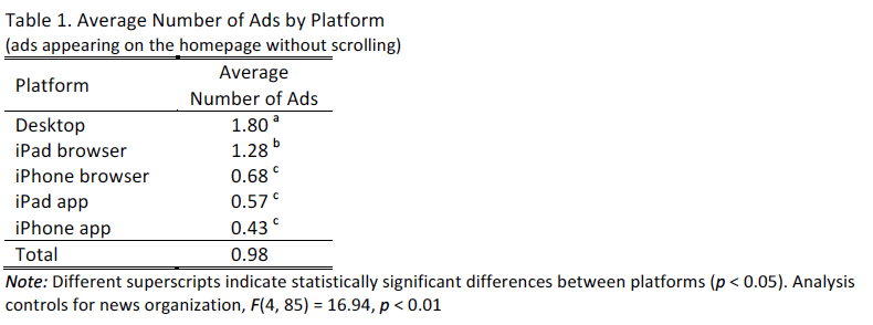
For each site, we coded how many ads were visible on the homepage of the site without scrolling. As can be seen in Table 1, the most ads appeared on desktop, followed by the iPad browser. On average, less than one ad appeared on the iPhone browser, iPad app, and iPhone app.
Of the 78 different sites and apps with ads, 97% had stationary ads, 44% had ads with video/movement, 38% had ads that automatically moved or played video content, 8% had pop-up ads that covered the content, 6% required a site visitor to wait a certain amount of time before the ad would close, and 5% had ads that required you to hit a button to close the ad in order to view the content.
Looking across all sites and apps, there were differences across the platforms for the presence of stationary ads, the presence of ads with video/movement, and the presence of ads that automatically moved. The desktop and iPad browser were most likely to have stationary ads – significantly more than appeared on the iPhone app, as shown in Table 2. The iPhone browser and iPad app fell in the middle on the presence of stationary ads.
The desktop version again was the most likely to have ads containing video, or ads that moved in some way on the screen. The iPhone browser and iPhone app were least likely to have ads containing video or movement.
Similarly, the desktop version was most likely to have ads that moved automatically, while the iPhone browser and app and the iPad app were significantly less likely to have ads that moved automatically.

Homepage Structure
We analyzed how many articles were visible on the homepage without scrolling (Table 3). On average, iPad browsers and desktop versions had the highest number of homepage articles and the iPhone browser and iPhone app had, on average, the fewest number of visible articles. Although we expected fewer articles on the smaller devices, the variability was considerable. For instance, the number of articles visible on the desktop version varied from 1 to 40. The number of articles visible on the iPhone browser varied between 1 and 18.

In addition to analyzing the average number of articles, we also investigated the number of photos. On average, sites had 3.84 photos on the homepage. There were no significant differences by platform.1 There was, however, variability across the sites. Two sites had no photos and one had 50 different photos visible on the homepage without scrolling.2 The vast majority of sites — 82% — had 5 or fewer photos visible on the homepage.
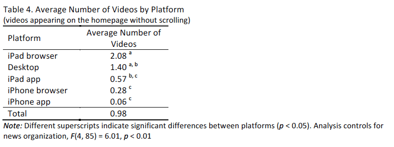
When turning to the average number of homepage videos, there were differences by platform, as shown in Table 4. The iPad browser and desktop versions again had the highest number of videos while the iPhone browser and app had the fewest.
For up to three of the top videos visible on the homepage of the site or app, we recorded the video length. We then computed the average video length for sites with at least one video. We were only able to complete this calculation for 31 of the sites, as the others either didn’t have video on the homepage (61 of the sites) or the video length couldn’t be computed, such as when a live video was visible or when the only indication of the video was a link to a separate page with video (22 of the sites). The average video length for sites that did have a video was just over three minutes (198 seconds.) There were no differences by platform.3
Of the 94 sites and apps with links to video visible on the homepage without scrolling, 20% had live video. The presence of live video did not vary by platform.4
We also looked at whether the articles had an associated time stamp on the homepage. For example, some stories would say “posted 1 minute ago.” Across all the sites and apps, 52% did not provide a time stamp associated with the articles visible on the homepage without scrolling. Thirty-nine percent included a time stamp that revealed minutes or smaller, 7% used hours, and 3% used days. Whether a site included a time stamp did not vary by platform.5
Navigation
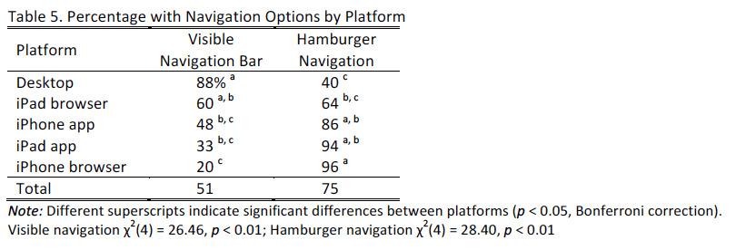
The sites and apps varied in how people were able to navigate the content. We started by analyzing what sort of navigation options were available. First, we looked for whether the site or app had a visible navigation bar, which appeared on the homepage and indicated different categories (e.g. Politics, Local News, etc.). This visible navigation bar was most common on the desktop and iPad browser, and was less common particularly on the iPhone browser.
Second, we examined whether “hamburger navigation,” or a navigation bar that would appear if one clicked on a hamburger symbol was available. As seen in Table 5, hamburger navigation was most common on iPhone browsers and iPad apps and was least common on desktop. Even on the desktop, however, 40% of sites had this form of navigation. Across all the sites and apps, only one site didn’t have either a visible navigation bar or hamburger navigation and 26% of the sites had both.
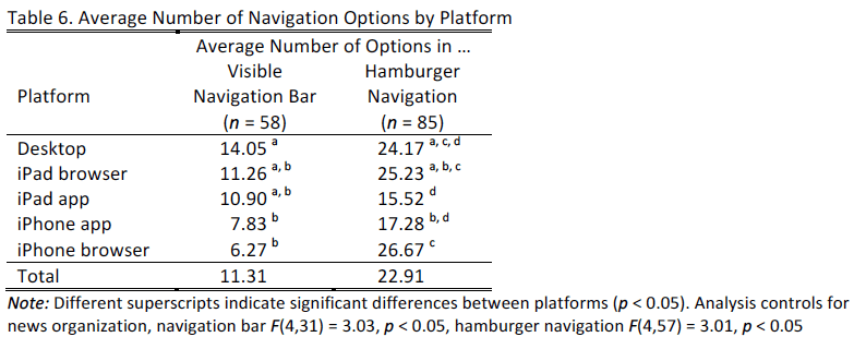
We counted how many options were available in the navigation bar or hamburger navigation when they were available. The number of options visible in the navigation bar varied by platform, as shown in Table 6. In the visible navigation bar, there were more options available on desktop than on the iPhone. This same pattern did not replicate when looking at the number of options in the hamburger navigation. Here, there were more options on the iPad browser than on the iPad app. The desktop and iPhone versions, however, fell in the middle in terms of the number of available options. Across all platforms, the number of options on a visible navigation bar varied between 2 and 30 and the number of options available in hamburger navigation menus varied between 4 and 75.
The final navigation component of the sites that we examined was whether they used infinite loading on the homepage, where a site visitor could continue scrolling without any apparent end to the articles that loaded. Across the sites and apps examined, 21% used infinite loading. There were no differences across the platforms in use of this feature.6
Article Attributes
For each site or app, we opened up to five of the top articles appearing on the homepage without scrolling. For each, we recorded the length of the article on the basis of how many scrolls it took to get to the end of the article. The average scroll length across the articles varied from 1 to 28. On several sites with a longer average scroll length, some articles consisted of many different pictures presented on a single page. Not surprisingly, the average number of scrolls was significantly greater on the smaller screen of the iPhone in comparison to the desktop and iPad versions (see Table 7).

We next looked at the recommendations available within the top articles to other content on the site or app. These recommendations could have been available below the article, in a sidebar next to the article, or embedded within the article. Ninety-six percent of sites had article recommendations on their article page.
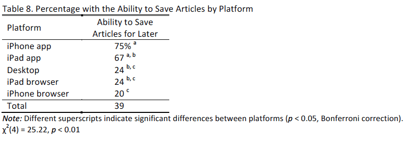
We also analyzed whether the site or app allowed the user to save articles to read later. Across all of the analyzed sites or apps, 39% had this capability. But there were significant differences by platform. Apps were most likely to have this capability and iPhone browsers were least likely (see Table 8).
Finally, we looked at whether the site or app allowed users to indicate, or automatically indicated, that the user had read an article. Only 10% of the sites and apps analyzed had this feature.
Interactive Features
Interactive features, such as quizzes and games, were rare on the sites and apps examined. Six percent of sites and apps had a carousel, a slideshow that displays a sequence of featured news content, visible on the homepage without scrolling. Within one scroll on the homepage, 5% had games, 3% had a quiz, and 1% had a poll.7
Fifty-seven percent of the sites had a way for people to sign in to the site, but there were differences by platform, as shown in Table 9. The desktop and browser versions were more likely to have a sign-in than the app versions.

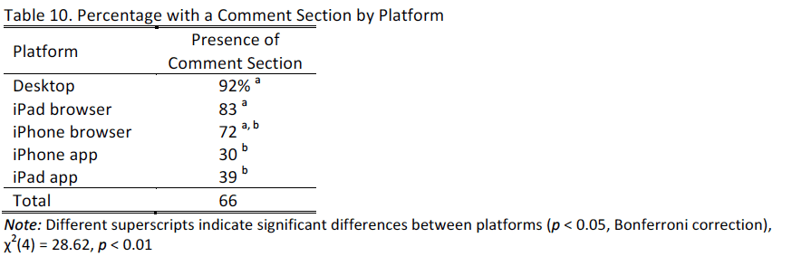
We next looked for the presence of comment sections among up to five articles featured on the homepage without scrolling. Across platforms, 34% did not have a comment section present. Nineteen percent had a comment section from Facebook, 9% from Disqus, 5% Livefyre, and 33% another platform. The presence of a comment section differed by platform, with the desktop and browser versions most likely to have a comment section and the app versions less likely (see Table 10).
Social Media
We evaluated the presence of social media buttons, whether on the homepage, in a navigation bar, or in up to five top articles displayed on the site or app. Facebook and Twitter were most common overall. Looking across platforms, social media buttons were prevalent on the desktop and browser versions, but were far less common on the app versions of the analyzed sites and apps. Note that we only recorded social media buttons made available by the news organization, not those that could be opened automatically on one’s smartphone or tablet (these depended on what social programs people already had available).
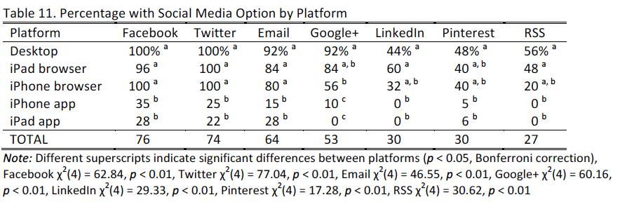
Other social media options that we analyzed were far less common. Instagram appeared on 12% of sites, YouTube on 19%, Tumblr on 18%, StumbleUpon on 12%, Reddit on 16%. Vimeo, Flickr, and Meerkat were available on fewer than five of the sites analyzed. It was not possible to examine differences across platforms for these social media due to the sample size.
Traffic Metrics by Platform
We obtained traffic information from comScore.8 The data below are for September 2015. In some instances, comScore did not have complete data. In these instances, data are reported only for the smaller available sample size.
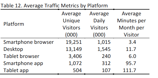
Although the smartphone browser and desktop attract the most visitors, the apps yield the greatest average minutes per visitor. These averages are shown in Table 12.
The comScore database also allows for a demographic profile of site or app visitors. The table below also presents U.S. demographic information for comparison. As shown below, the average percentage of females using news on a smartphone browser, smartphone app, and tablet browser is roughly similar to the percentage of females in the population. The average percentage of females using tablet apps, however, is less than the U.S. population.
When it comes to income, news use on any platform is concentrated among those with higher incomes.
Age has a more complicated relationship with news use by platform. Younger people (18-34 years old) are over-represented on smartphone browsers relative to the general population while older people (55 years and above) are under-represented. Other age comparisons are more similar across platforms, and relative to U.S. population figures.
When looking at the percentage of Black / African-American users of the news organizations’ digital sites, all fall below the percentage of Black / African-Americans in the U.S. population.9

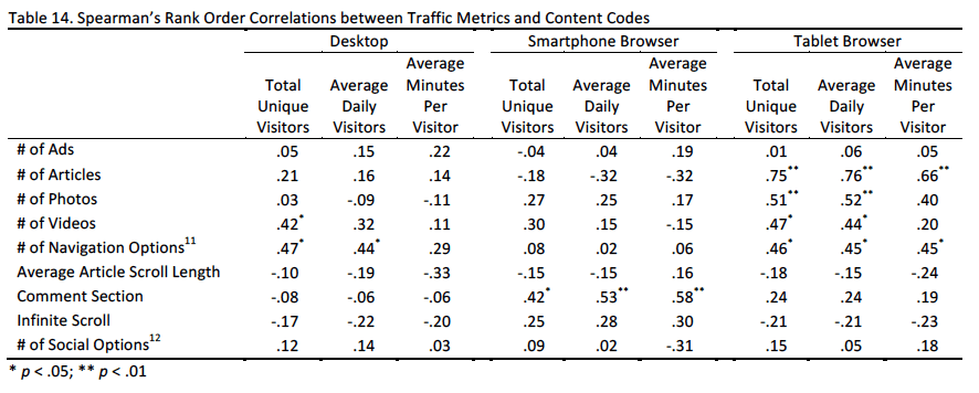
Traffic Metrics by Content
In the final table, we look at relationships between the traffic figures and content categories. Data presented in this section should be treated as preliminary, as the number of observations is small and does not allow us to control for other variables. Further, the relationships are correlational, not causal. As there are considerable differences in visitors and time spent by platform, we looked at the platforms separately.
Further, as comScore only had complete data (n = 25) for the smartphone browser, desktop, and tablet browser, we confine our analyses to these three platforms. We evaluated possible relationships between our content categories and the traffic metrics.10 To interpret the statistics, we look at whether the relationship is positive (as one measure increases, the other increases) or negative (as one measure increases, the other decreases) and whether the relationship is statistically significant (indicated by the asterisks).
As shown in the table below, the following content categories were positively related to at least one of the traffic metrics: number of articles (tablet browser), number of photos (tablet browser), number of videos (desktop, tablet browser), number of navigation options (desktop, tablet browser), and the presence of a comment section (smartphone browser).11,12
Methodology
News Organization Selection
We selected 25 of the top news outlets to analyze for this report. The following criteria were used to select these organizations: First, we looked at comScore’s Media Metrix News / Information category, as well as the subgroup General News, for both mobile and desktop unique visitors. Next, we compared our list to one developed by Pew Research. Based on this comparison, we added The Wall Street Journal and Business Insider, which were not listed under comScore’s News / Information category but were news organizations. We also included Vox as a final organization to analyze because of the unique mobile style of their website. Although Yahoo and Google News have large numbers of unique visitors, we opted to restrict our coding to original news sources and exclude aggregators.
For sites that had a paywall (e.g. Wall Street Journal), we coded as much as possible without purchasing access to the site.
Platform Selection
Desktop
To do the desktop coding, we used Windows 7. We chose this operating system because StatCounter, an independent service that analyzes billions of page views per month, found that Windows 7 ranked highest for desktop web browsing, with 46 percent of the market share for August 2015. Further, NetMarketShare, another web analytics company, also found high use of Windows 7, with 58% of the market share for August, beating Windows XP (12.14%) and Windows 8.1 and 8.2 (11.39% and 2.56%).
Windows 10, the most recent Windows operating system released this summer, accounted for only 5.21 percent of the market in August. On the desktop version, we used screen resolution 1280 x 1024 to code the sites, as this ratio was available on the computers we used for coding. To do the coding, we used Dell laptops and desktop computers. We compared across the different computer versions to ensure that the same homepage display was visible regardless of the machine used.
We used Google Chrome as the browser for our coding. According to W3Counter, a free web stats counter, Google Chrome accounts for a majority of the web browser market share at 46.5 percent in August 2015 (based on visits to 34,986 websites using W3Counter). According to the federal government’s Digital Analytics Program, which monitors visits to federal websites through Google Analytics, Google Chrome accounts for 34.7 percent of all visitors. Finally, StatCounter, finds that Google Chrome accounted for almost 50 percent of desktop page visits in the U.S. in August 2015.
iPhone Smartphone and iPad Tablet
We used the iPhone 6 to do our coding. Although the Android operating system ran on 51.9% of the smartphone market compared to Apple’s iOS (42.9%) in 2014 (Nielsen, 2014), trends show that Apple and iPhones are increasing in popularity while Android’s popularity appears to be slowing (comScore, 2015; TechCrunch). Additionally, Apple is the largest single smartphone manufacturer, with 43.6% of the smartphone shares compared to other manufacturers such as Samsung or LG (Nielsen, 2015). For the purposes of coding, we feel confident that coding the iPhone 6 on the most recent iOS update provides an accurate experience of U.S. users, given that no singular Android device beats the Apple iPhone.
We selected an iPad 2 as the tablet to use for our coding. This device was selected to stay consistent with choosing the iPhone 6. In addition, Apple owned 32.7% of the tablet device market share in 2014 (IDC, 2015), shipping more tablets than any other manufacturer.
In order to stay consistent and up-to-date, we used the most recent iOS update, iOS 9.0.1, as the operating system for experiencing the mobile web browsers and applications.
For the browser versions of the iPhone and iPad, we used Apple’s pre-installed default web browser, Safari, to test the mobile web browser webpage versions. Any links opened from e-mail or text message launch in Safari, an option which Apple does not allow one to change. StatCounter found that Safari is the most used mobile web browser for U.S. users in August 2015, at 49.6% of mobile page visits.
We used three methods to determine whether a news media organization had a mobile and tablet application: (1) We looked in the comScore Media Metrics database, which indicates whether an organization has a distinct mobile application, (2) We searched the news organization’s name in the Apple app store on both the iPhone and the iPad, and (3) We looked at whether the site advertised a mobile application for the news media.
Content Analysis
We developed a systematic guide for coding the browser and mobile versions of each site. To form the guide, we first looked through the academic literature on mobile devices to understand what had been done previously. The following source provided background for our coding: Cox Institute for Journalism Innovation, Management & Leadership.
After undergoing several revisions based on our preliminary testing and insights from journalism experts and those working with mobile, we created a codebook that we would use to systematically examine the content of the news sites.
Before completing a content analysis, it is important to achieve reliability. What this means is that we need to be sure that all coders working on the project are making nearly identical coding decisions when they are observing the mobile content. Coders would go to the same site at the same time and then code it independently. Two coders completed the analysis for 28 different sites and apps and the three coders for 19 different sites and apps. We computed reliability using Krippendorff’s alpha, a statistic which varies between 1.0, indicating perfect reliability, and 0.0, indicating unreliable coding. Using this metric, reliabilities between 0.67 and 0.80 are considered adequate but more preliminary. Reliabilities in excess of 0.80 are considered quite strong. Reliability metrics for the codes used in this report can be seen in the full report.
SUGGESTED CITATION:
Stroud, Natalie Jomini, Cardona, Arielle, and Peacock, Cynthia. (2016, July). A Digital News Snapshot: An Analysis of 25 of the Top Sites Across Platforms. Center for Media Engagement. https://mediaengagement.org/research/digital-news-snapshot/
- F(4, 85) = 2.21, p = 0.07, controlling for organization [↩]
- We counted every image in carousel containing multiple photos as a photo. [↩]
- F(4, 8) = 1.07, p = 0.43 controlling for organization [↩]
- χ2(4) = 4.00, p = 0.41 [↩]
- χ2(4) = 4.92, p = 0.30 [↩]
- χ2(4) = 1.50, p = 0.83 [↩]
- No polls or quizzes were visible on any of the sites or apps included in our practice set. For this reason, caution is warranted when looking at these percentages because reliability could not be computed. [↩]
- Source: comScore Media Metrix, September 2015, U.S. [↩]
- U.S. population data obtained from American Community Survey. Note that the age metrics include those under 18 years of age. If they are excluded, 31% are 18-34, 34% are 35-54 and 35% are 55 and above. [↩]
- Given the small sample size and possibility for outliers, we used Spearman’s rank order correlations. [↩]
- We added the number of navigation options across a hamburger navigation menu and a visible navigation bar. [↩]
- We added up the total number of social options available based on those that we measured. [↩]