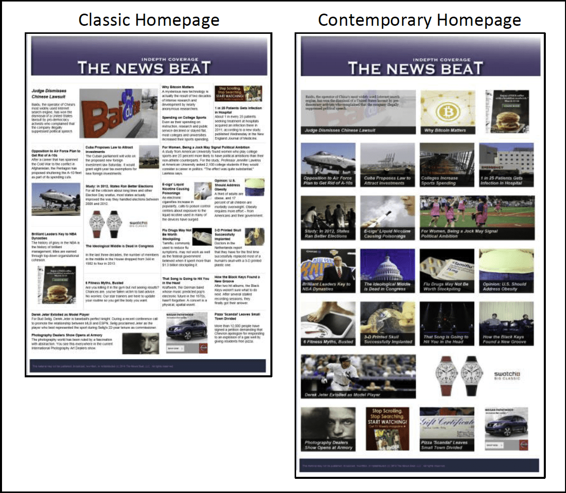
Homepage layout matters. It affects what people view on a website and what they remember from the news. Across a series of three experiments, we analyzed what happens when people are given the same news content presented in different ways. Some of our 2,671 study participants browsed a site with a classic newsprint layout, while others looked at a page with a contemporary, modular and image-based layout. The same 20 articles, drawn from mainstream news media coverage about evergreen subjects, appeared on both sites.
Key Findings
The results were as follows:
- Unique page views increased by at least 90 percent when participants viewed the contemporary homepage compared to the classic homepage.
- Recall of details from the articles, although low for all participants, nonetheless increased by at least 50 percent when participants viewed the contemporary homepage compared to the classic homepage.
- Study participants rated the contemporary site more positively than the classic site.
- Where the articles appeared on the page affected article recall more consistently than whether people clicked on the article.
- The differences between the classic and contemporary homepages were due to the site layout and images, not due to a technical feature allowing people to view an article superimposed above a faded version of the homepage.
The Problem
How news is presented affects what people learn, even when the content is similar. For example, people learn differently from television and print news,1 and from print and online news.2 Even differences within the same medium can affect learning. For example, the presence or absence of hyperlinks in a story changes what people learn about the story topic.3
In this vein, news homepage designs are undergoing an evolution, and it is important to consider how these design differences will affect learning. A key element in the changing nature of news homepage layouts is the move to a cleaner, photo-heavy scheme over a more classic print-style layout.4 The latter design is one that places an emphasis on high-density information, with a homepage loaded with headlines, ledes, and photos, all of varying sizes. By inspection, many news homepages connected to traditional news organizations adopt a print-style design.
Unfortunately, the print-style design may hamper readers’ ability to learn from the site. Research has suggested that too many items and complicated organization can lead to weak performance of a task – hindering object recognition, memory, and search skills.5 For these reasons, web design scholars emphasize simple website layouts.6 Indeed, research has shown when comparing simple web layouts to complex layouts, users prefer less cluttered and simpler layouts.7
Seeing as how some news websites are moving to newer designs, but many still retain the more complicated layout, we compared a classic news website to a contemporary version that featured less text and more photos. In addition to gauging readers’ knowledge acquisition, we also looked at how format differences could impact page views, a metric important to many newsrooms.
Implications for Newsrooms
Layout matters, and it is consequential in terms of page views and what people recall from the news. The results show that people accessed more pages, appreciated, and learned more about the information contained in news articles when browsing a website with a contemporary homepage compared to a website with a classic homepage. These differences did not vary depending on the respondents’ age, education, or level of political knowledge. Broadly, these results support news organizations experimenting with changes to their homepage, and considering a move from a more classic to a more contemporary design.
Of course, homepage redesign is not a small matter for a news organization. In addition to the expense, organizations must carefully consider how to best introduce the change to their audience; some examples include The Guardian’s iterations, The Daily Beast’s open letter, and the New York Times’ response to readers. What this research adds is a starting point for how one might redesign a news homepage and a research method that could help to reveal whether a redesign will have a desired effect.
The Study
In such an investigation, it is critical to account for additional variables that could influence newsreaders. Four such variables include education, age, background knowledge, and format familiarity. The knowledge gap suggests that those with more education gain more knowledge when exposed to mass media than those with less education.8 Past research shows that this relationship can depend on the type of media to which a person is exposed (e.g. newspaper, television, the Internet). In regard to the Internet, some studies have shown that it is better than print for those with lower education,9 while others have suggested that the Internet increases the knowledge gap between lower and higher educated adults.7 This disagreement could be due to the idea that using Internet news requires extra skills and active involvement in selecting stories – two aspects that differ from consuming offline news.10 As discussed above, we analyzed and found little support for systematic differences in the results depending on respondents’ education, age, and levels of political knowledge.
Another variable that may influence knowledge gain deals with readers being more or less familiar with online news presentation and their ability to process information in that medium.11 For example, if a print newspaper reader interacts with news online, they will have greater recall of information for a website that resembles a classic newspaper as opposed to a website that is more contemporary and different in format from print news. Again, there was little evidence of a systematic difference across our first two studies.
Based on the literature to date, we conclude that homepage design does play an important role in what people do online and what they take away from interactions with online news.
More Page Views on Contemporary Site
Consistently, the contemporary site garnered more page views. We tracked how many unique pages were accessed by each study participant, excluding the homepage.
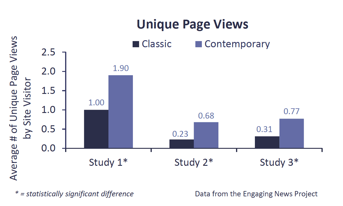
In Study 1, the contemporary website yielded a 90 percent increase in unique page views compared to the classic site. On the classic site, we recorded 427 unique page views for 429 site visitors; the contemporary site yielded 813.12
There were a few noteworthy differences between the studies. In Study 1, participants were required to stay on the site for a minimum of 90 seconds before they could continue with the study. In Studies 2 and 3 we allowed participants to browse for however much time they wanted. In Study 3, we also changed the order of the articles that appeared on the page and the site design for some study participants – features that we will discuss in more detail later in this report.
In Study 2, page view results were even stronger than in Study 1. Page views increased on the contemporary site compared to the classic site, although the overall number of page views was lower. On the contemporary site, we recorded 274 unique page views for 405 visitors; the classic site yielded 93.13
In Study 3, the contemporary page yielded 254 page views for 332 site visitors, compared to 105 page views on the classic page. The contemporary page resulted in an over 140 percent increase in page views compared to the classic site.14
Across all three experiments, unique page views were higher on the contemporary than the classic site. In the chart, we present the same results discussed in text, but instead show the average number of unique pages other than the homepage accessed by the study participants. When we looked at each of the 20 articles individually, we saw that nearly every article enjoyed more page views when it appeared on the contemporary website compared to the classic version.
Greater Recall of Article Details When Viewing the Contemporary Site
After browsing the site and answering several questions about what they thought of the site, study participants were asked to write down up to ten articles that they could remember from the site. Afterward, they were asked to write down all of the details that they could recall about the first two (Study 1) or three (Studies 2 and 3) articles that they mentioned. We determined how many of the details they recalled came from the homepage and how many came from the full text of an article from the site.
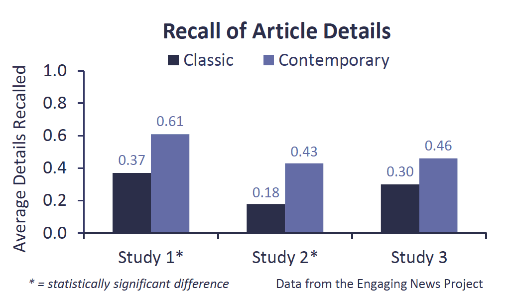
Recall of article details varied depending on whether people saw the classic or the contemporary site. People recalled more article details when they browsed the contemporary site in comparison to the classic site. The averages are shown in the chart, and are statistically significant in Studies 1 and 2, but fall just short of statistical significance in Study 3.15
When looking at the number of homepage details recalled, there were fewer differences between the classic and contemporary sites.16 In Study 1, those browsing the classic site recalled 3.09 details and those browsing the contemporary site recalled 2.90. In Study 2, those browsing the classic site recalled 3.19 details compared to 2.85 for those looking at the contemporary site, a result that fell short of statistical significance. In Study 3, participants recalled an average of 3.48 homepage details when they viewed the classic site and 2.84 when they viewed the contemporary site. This difference was statistically significant.17 These findings likely result from the fact that the classic homepage presented the full text of the ledes on the screen, while the contemporary homepage required people to scroll over the image in order to read the lede. That the differences are not larger, and more consistently significant, suggests that the learning implication of making the lede appear only when scrolling over the headline is minimal.
Across the three studies, there were no differences in the number of articles that participants recalled when they were asked to list up to 10 articles that they remembered from the website – participants listed a similar number regardless of whether they saw the classic or the contemporary site.18
Some Evidence That People Prefer the Contemporary Site
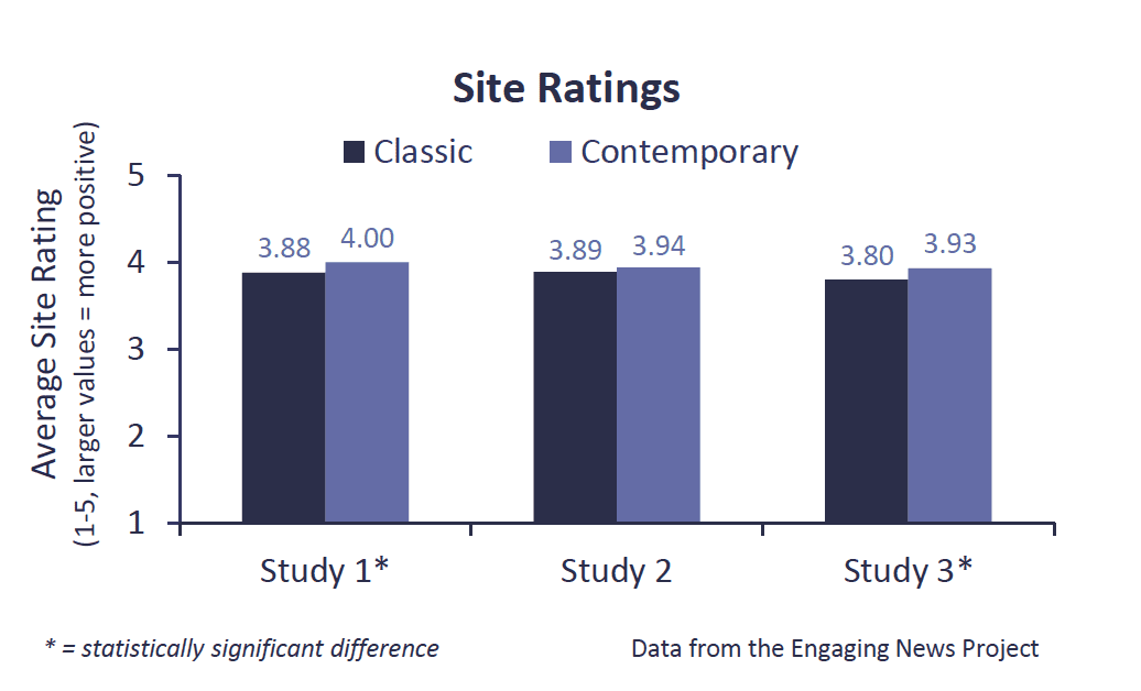
We asked study participants to indicate how enjoyable, informative, credible, trustworthy, interesting, clear, and easy to navigate they found the site.19 We averaged participant responses to these questions to get an overall measure of what people thought of the site.
In Studies 1 and 3, participants rated the contemporary site more positively than the classic site. In Study 2, the difference in how participants felt about the sites was not statistically significant.20
Greater Recall for Most, Least Prioritized Articles on the Classic Site
As we mentioned earlier, after answering some general questions about the website, we asked study participants to list up to 10 articles that they recalled from the website. We analyzed which stories people recalled and whether the recalled articles differed between the contemporary and classic sites.
Although there were no differences across the two sites in the number of articles recalled, which articles people recalled did vary depending on the site people browsed.21 We report on the differences for Studies 1 and 2 here and then turn to how article order affected recall in Study 3 later in this report.
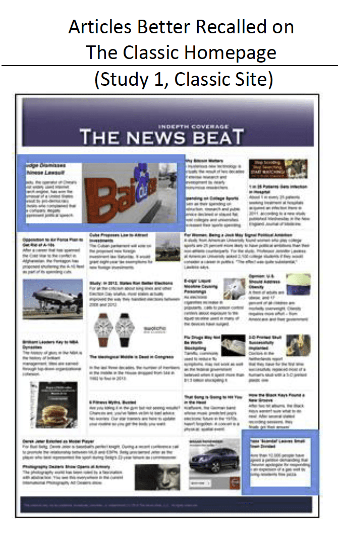
Two articles were recalled better on the classic site in Studies 1 and 2: the story in the upper left corner of the site about a lawsuit involving the Chinese search engine Baidu and the story in the lower right corner about Chevron giving residents free pizza in response to an explosion of a gas well.22 The stories are highlighted in blue boxes in the image.
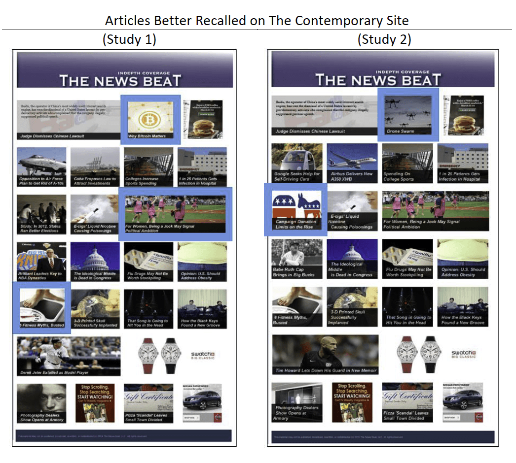
On the contemporary site, the results were more varied across the two studies. The articles better recalled on the contemporary site are highlighted in the image below.23 We suspect that the higher recall rates have to do with the articles having striking visuals that stand out in comparison to the other images on the page. For example, both the fitness myths and the campaign donations articles do not have a defined border that characterizes the other images on the page.
Few Individual Differences in Reactions to Classic, Contemporary Sites
We next examined whether different types of people reacted differently to the classic and contemporary sites in Studies 1 and 2. Perhaps only those with higher levels of education, for example, preferred the contemporary site. We analyzed whether people responded to the contemporary and classic sites differently depending on their:
- Background political knowledge, assessed using a 6 question quiz
- Level of education
- Age
- Familiarity with the format
We looked at whether these characteristics affected (a) the total number of page views, (b) the total number of articles recalled, (c) the number of homepage and article details recalled, and (d) perceptions of the site. In general, the results remained the same regardless of how much people knew about politics, how educated they were, how old they were, or how familiar they were with the format of the site. A few differences did emerge, however:
For Study 1, there was one difference.
- Regardless of their level of political knowledge, study participants clicked on more pages when they browsed the contemporary site than when they browsed the classic The increase in page views was, however, larger among those with higher levels of political knowledge.24
For Study 2, there were two differences.
- Regardless of their level of education, study participants recalled more article details when they browsed the contemporary site than when they browsed the classic The increase in article details recalled was, however, larger among those with lower levels of education.25
- Those with low levels of familiarity with the site format recalled a few more articles when they saw the classic site compared to the contemporary Those who were more familiar with the site format, however, recalled significantly more articles when they viewed the contemporary site than when they viewed the classic site.26
Overall, there were few significant differences in how people browsed or learned from the contemporary and classic sites depending on their background characteristics. In no instance did a result replicate across both Study 1 and 2.
The Layout Matters More Than the Tech
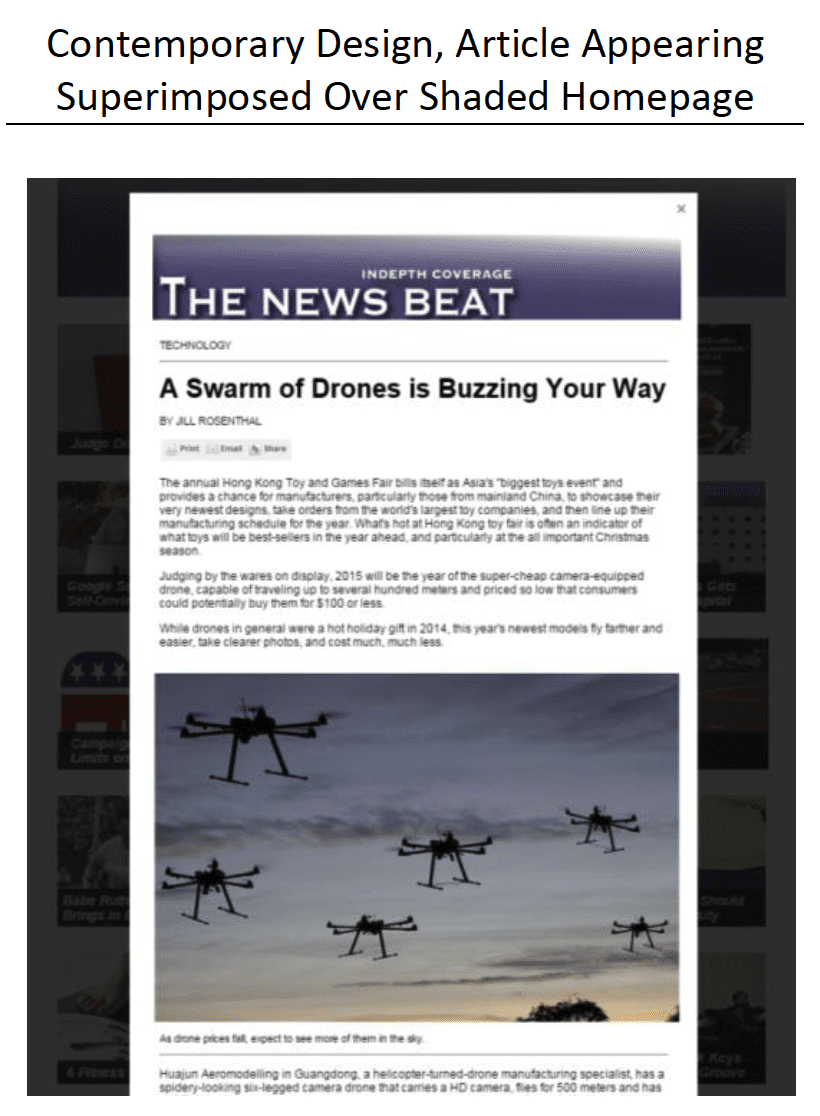
As part of Study 3, we analyzed which mattered: Was it the layout of the homepage with images and a fading, rollover lede effect (where the lede of the article appeared only when a user scrolled over the image and headline) on the contemporary page? Or, was it the way in which each article appeared superimposed over a shaded homepage in the contemporary design? We created a third web design, which we called modified-classic. This page was identical to the classic site, except that when you clicked on an article, it appeared superimposed over the classic homepage rather than opening a new page. Thus, the modified-classic site functioned just like the contemporary site, but its layout was just like the classic site.
Across all of our tests – for the number of unique page views, article recall, homepage and article details recalled, and site perceptions – there were no differences between the classic and modified-classic sites. There were significant differences between the modified-classic and contemporary sites, however.27 These results suggest that the layout – as opposed to how articles appeared over the homepage – is responsible for the results discussed throughout this report.
Article Position on the Page Affects Recall More Than Page Views
Also in our third study, we switched the article order to see if it would affect where people clicked on the page. Some people saw the articles in the same position as they were in Study 2. Others saw the same homepage, but with eight articles placed in a different spot on the page. Study participants thus saw one of four different websites: (1) classic design, order 1, (2) classic design, order 2, (3) contemporary design, order 1, and (4) contemporary design, order 2.
Article recall was affected by where the article appeared on the page. For four of the six articles that we re-ordered on the site, recall was higher when the article was more prominently displayed. Order didn’t matter for the other two articles that we re-ordered; people were equally likely to recall the articles regardless of where they appeared on the page.28
The effect of article order was less clear when it came to page views. For four of the twenty articles, order mattered for the contemporary site, but not for the classic site.29 For each of these articles, page views increased for the highlighted articles when they appeared in Order 2 compared to when they appeared in Order 1. We suspect that the content and the visuals of the surrounding images influence whether people click on any given article – by re-ordering the articles, some were more enticing given their position and the surrounding content when they appeared on the Order 2 site compared to the Order 1 site.
Methodology
Studies 1 & 2
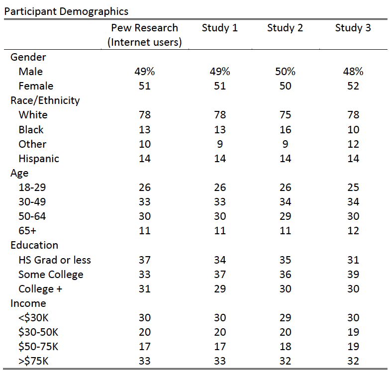
Study 1 was fielded in September of 2014 and 901 participants completed the study.30 Study 2 was fielded in February of 2015 and 874 participants completed the study. Both studies were fielded by Survey Sampling International (SSI). Although the participants were not randomly selected, they are demographically diverse and representative in the sense that the demographics of the SSI panel members completing the studies were selected to match demographic targets from a nationally- representative, random sample survey conducted by Pew Research. A comparison of the demographic attributes of participants in these studies and the Pew study can be found in Table 1.31
Two versions of the website were created for the purpose of this study. The classic version was created to resemble a standard newspaper-based design. The contemporary version was styled in a manner more reminiscent of a tablet or mobile version of a news website, although we purposefully required participants in Studies 2 and 3 to use a desktop so that technological differences could be ruled out as an explanation for the findings. Both versions contained identical headlines and ledes. On the classic site, the ledes appeared next to the headline. On the contemporary site, the lede would appear when the site visitor scrolled over the top of the image, which reduced clutter by limiting the amount of visible text (an example can be found in the screen capture of the contemporary site on the first page of this report, where the first article on the homepage shows how the lede was made visible by scrolling over the story). All articles included on the sites were identical, covered topics that would not be out-of-date quickly, and had appeared in the media.32
Study participants were asked to look at one of two versions of The News Beat website. They were told “We would like you to browse the website, clicking on and reading articles, just as you would when browsing websites you usually visit.” After browsing the website, respondents were asked questions about the site before we asked the key recall measures described below. There are several minor differences between Studies 1 and 2, the details of which are described in the endnotes.33
Study 3
Study 3 was fielded from late April through early June of 2015, again by SSI. A total of 896 participants completed the study. As before, a comparison of the demographic attributes of participants in these studies and the Pew study can be found in Table 1.
Study participants were randomly assigned to one of five different experimental conditions. The first two conditions, classic and contemporary, replicated the two conditions from Study 2. The next two conditions were identical, except that we switched the order of six articles on the page. We flipped the location of the (1) drone and Congress articles, (2) the Google car and 3-D skull articles, and (3) the flu drug and pizza articles. The final condition was a modification to the classic page (order 2) where we added a feature from the contemporary page: When site visitors clicked on an article, the article page opened, but the homepage was still visible in a darkened form behind the article page. Site visitors could use the back button or could click outside of the article on the darkened homepage to return to the homepage. This allowed us to understand whether differences between the classic and contemporary sites were the result of the site layout or the technology that made it simpler to return to the homepage.34 To analyze these results, we compare the contemporary, classic, and modified-classic sites to each other.
Variables of Interest in Studies 1, 2, & 3
Page Views. To measure site engagement, we unobtrusively tracked how many pages each respondent accessed from The News Beat site. We computed the number of unique page views for each respondent, excluding the homepage (Study 1: M = 1.46, SD = 2.63; Study 2: M = 0.44, SD = 1.39; Study 3: M = 0.49, SD = 1.52).35
Number of Articles Recalled. Study participants were asked to list as many articles as they could remember from the website in up to 10 different fields.36 We recorded whether the recalled article appeared on the site and, if so, which article it was. For each person, we added the total number of articles correctly recalled from the site (Study 1: M = 2.06 stories, SD = 1.64; Study 2: M = 1.84 stories, SD = 1.86; Study 3: M = 1.79, SD = 1.88).
Number of Details Recalled. For each of the first two stories listed in Study 1, and for each of the first three stories listed in Studies 2 and 3, we asked study participants to provide us with any additional details that they could recall about the story in an open-ended text box. For each open-ended response, we recorded (a) the number of details mentioned that appeared in the story headline/lede available on the article homepage and (b) the number of details mentioned from the text of the article.37 We then summed the number of details respondents noted from the homepage (Study 1: M = 2.99, SD = 2.12; Study 2: M = 3.03, SD = 3.01; Study 3: M = 3.24, SD = 3.24) and from the article (Study 1: M = 0.49, SD; Study 2: M = 0.30, SD = 1.12; Study 3: M = 0.36, SD = 1.22).
Background Political Knowledge. We asked study participants a series of six basic political knowledge questions as recommended by Delli Carpini and Keeter (1996), such as what job is currently held by John Roberts. We computed the number of correct responses (Study 1: M = 2.63, SD = 1.66, Cronbach’s α = 0.63; Study 2: M = 2.39, SD = 1.40, Cronbach’s α = 0.59). As no consistent results emerged in Studies 1 and 2, we do not analyze this variable in Study 3.
Familiarity. We asked study participants to indicate how familiar they were with the format of the website that they saw from 1 = very unfamiliar to 4 = very familiar. (Study 1: M = 2.37, SD = 0.98; Study 2: M = 2.56, SD = 0.92). As no consistent results emerged in Studies 1 and 2, we do not analyze this variable in Study 3.
SUGGESTED CITATION:
Stroud, Natalie Jomini, Curry, Alex, Cardona, Arielle, and Peacock, Cynthia. (2015, July). Contemporary vs. Classic Design. Center for Media Engagement. https://mediaengagement.org/research/news-presentation/
- As we captured data for 429 people in the classic condition and 452 in the contemporary condition, we adjusted the contemporary page view data for what it would be for 429 participants. This allows us to preserve comparability between the page view metrics, despite a slightly different sample size. In Study 1, participants seeing the classic website viewed 1.00 unique pages (SE = 0.09) and participants seeing the contemporary site viewed 1.90 unique pages (SE = 0.15) (t(881) = 5.22, p < 0.01). [↩]
- As before, there was some imbalance in the number of people in each condition, as is expected with random assignment. There were 405 in the contemporary condition and 440 in the classic condition. We adjusted the classic condition for what it would be with 405 subjects. In Study 2, participants seeing the classic website viewed 0.23 unique pages (SE = 0.04) and participants seeing the contemporary site viewed 0.68 unique pages (SE = 0.09) (t(843) = 4.73, p < 0.01). [↩]
- As before, there was some imbalance in the number of people in each condition, as is expected with random assignment. There were 332 site visitors for the contemporary site and 351 in the classic condition. We adjusted the classic condition for what it would be with 332 subjects. People clicked on more pages when they saw the contemporary site than when they saw the classic site (F(1, 679) = 13.14, p < 0.01). On average, the contemporary site yielded 0.77 page views (SE = 0.09) compared to 0.31 page views on the classic site (SE = 0.09). The main effect of article order was not significant on the total number of pages viewed (F(1, 679) = 2.39, p = 0.12). An interaction between site design and article order was marginally significant (F(1, 679) = 3.49, p = 0.06) in predicting the total number of pages viewed. Although the interaction result was only marginally significant, inspection of the means revealed that although the number of page views was greater on the contemporary than on the classic site regardless of the article ordering, the difference was larger with the new ordering. [↩]
- Those viewing the contemporary website recalled significantly more details from the text of the articles (Study 1: classic M = 0.37, SE = 0.05; contemporary M = 0.61, SE = 0.06, t(899) = 3.04, p < 0.01; Study 2: classic M = 0.18, SE = 0.04; contemporary M = 0.43, SE = 0. 07, t(872) = 3.35, p < 0.01). In Study 3, those viewing the contemporary design also recalled more details contained in the articles (M = 0.46, SE = 0.07) compared to those viewing the classic site (M = 0.30, SE = 0.07), although the difference was only marginally significant (F(1, 705) = 2.97, p < 0.10). There was no main effect of article order (F(1, 705) = 0.26, p = 0.61), nor an interaction between article order and design (F(1, 705) = 0.00, p = 0.99). [↩]
- Regardless of whether study participants saw the classic or contemporary site, they recalled a similar number of details from the homepage (Study 1: classic M = 3.09, SE = 0.11, contemporary M = 2.90, SE = 0.09, t(899) = 1.32, p = 0.19; Study 2: classic M = 3.19, SE = 0.15, contemporary M = 2.85, SE = 0.14, t(872) = 1.67, p = 0.10). [↩]
- The data reported here involve four of the conditions in the study: 2 order x 2 layout. When analyzing the details recalled by site design, those viewing the classic design recalled more homepage details (M = 3.48, SE = 0.17) than those viewing the contemporary design (M = 2.84, SE = 0.17) (F(1, 705) = 7.08, p < 0.05). There was no main effect of article order (F(1, 705) = 0.01, p = 0.91), nor an interaction between article order and design (F(1, 705) = 0.61, p = 0.44). [↩]
- In Study 1, the difference between the total number of articles recalled for those viewing the classic site (M = 2.01, SE = 0.07) was not statistically different from the total number recalled by those viewing the contemporary site (M = 2.11, SE = 0.08) (t(899) = 0.94, p = 0.35). The same held true in Study 2 (classic site M = 1.82, SE = 0.09; contemporary site M = 1.87, SE = 0.09; t(872) = 0.45, p = 0.65). In Study 3, there was not a significant main effect of site design (F(1, 705) = 0.20, p = 0.65) or article order (F(1, 705) = 0.01, p = 0.93) on the number of articles recalled. Further, there was not an interaction between site design and order (F(1, 705) = 1.59, p = 0.21) in predicting the total number of articles recalled. [↩][↩]
- These items formed a reliable measure (Study 1: Cronbach’s α = 0.88; Study 2: Cronbach’s α = 0.87; Study 3: Cronbach’s α = 0.87). [↩]
- The difference between the classic and contemporary sites was significant in Study 1 (t(899) = 2.34, p < 0.05). The difference was not significant in Study 2 (t(872) = 0.96, p = 0.34). In Study 3, again looking at the four conditions (2 order x 2 layout), there was a main effect of layout (F(1, 683) = 5.21, p < 0.05), but not for order (F(1, 683) = 0.00, p = 0.99), nor was there an interaction between the two (F(1, 683) = 0.28, p = 0.60). [↩]
- In Study 1, 22.8% recalled the Baidu article on the classic page and 14% on the contemporary page (z = 3.38, p < 0 .01). Further, 23.1% recalled the pizza article on the classic page compared to 11.7% on the contemporary page (z = 4.48, p < 0.01). In Study 2, 23.4% recalled the Baidu article on the classic page compared with 16.3% on the contemporary page (z = 2.58, p < 0.01); 18.2% recalled the pizza article on the classic page compared to 8.9% on the contemporary page (z = 4.17, p < 0.01). [↩]
- In Study 1, 13.2% recalled the bitcoin article on the classic site compared with 18.1% on the contemporary site (z = 2.00, p < 0.05); 9.1% recalled the female athlete article on the classic site compared with 14.5% on the contemporary site (z = 2.48, p < 0.05); 9.6% recalled the fitness myths article on the classic page compared with 15.3% on the contemporary site (z = 2.56, p < 0.05). In Study 2, 15.5% recalled the drone article on the classic site compared with 30.2% on the contemporary site (z = 5.11, p < 0.01); 0.9% recalled the campaign donation article on the classic site compared with 4.3% on the contemporary site (z = 3.14, p < 0.01). [↩]
- In a negative binomial regression including condition, political knowledge, age, education, familiarity, and their interactions predicting page views, the interaction between condition and political knowledge was significant (Wald χ2(1) = 4.46, p < 0.05). [↩]
- In a Poisson regression including condition, political knowledge, age, education, familiarity, and their interactions predicting the number of article details recalled, the interaction between condition and education was significant (Wald χ2(1) = 4.37, p < 0.05). [↩]
- In a Poisson regression including condition, political knowledge, age, education, familiarity, and their interactions predicting the number of articles recalled, the interaction between condition and familiarity was significant (Wald χ2(1) = 4.37, p < 0.05). [↩]
- The contemporary site yielded significantly more page views (M = 0.98, SE = 0.12) than the classic site (M = 0.30, SE = 0.11) or the modified-classic site (M = 0.34, SE = 0.11) (F(2, 521) = 10.73, p < 0.01). Looking at the individual articles by running logistic regressions predicting whether each respondent did, or did not, view a page based on the website they viewed revealed the following: There were more page views on the contemporary site in comparison to the modified-classic site for five articles. In no instance was there a significant difference between the classic site and the modified-classic site. There were no differences among the contemporary, classic, and modified-classic sites in the total number of articles recalled (F(2, 541) = 0.17, p = 0.84). In looking at recall of the individual articles, some differences did emerge: Article recall was significantly different between the contemporary and modified-classic sites in six instances. In no instance did article recall vary between the classic and modified-classic sites. There were no significant differences in the number facts recalled when comparing the contemporary, classic, and modified-classic conditions (Homepage facts: F(2, 541) = 1.37, p = 0.26; Article facts F(2,541) = 1.46, p = 0.23). The means, however, were in the direction of the previous conclusions. There were no significant differences in site perceptions (F(2, 525) = 2.07, p = 0.13), although again the mean was higher for the contemporary condition (M = 3.95, SE = 0.06) than the classic (M = 3.87, SE = 0.06) or modified-classic (M = 3.78, SE = 0.06) conditions. [↩]
- Using logistic regressions to predict article recall, we found a significant effect of order for the following pairs of articles that had been re-ordered: (drone B = -1.10, p < 0.01 and Congress B = 1.29, p < 0.01; Google car B = -0.65, p < 0.01 and 3D skull B = 0.49, p < 0.05). [↩]
- For these four articles, there was a significant interaction between article order and layout when predicting page views. For Congress, 1.2% viewed the article on the classic site, order 1; 0.0% on the classic site, order 2; 0.6% on the contemporary site, order 1; and 8.0% on the contemporary site, order 2 (interaction F(1, 679 = 14.28, p < 0.01)). For college sports, 1.2% viewed the article on the classic site, order 1; 0.5% on the classic site, order 2; 0.6% on the contemporary site, order 1; and 6.7% on the contemporary site, order 2 (interaction F(1, 679 = 6.13, p < 0.01)). For campaign donations, 1.2% viewed the article on the classic site, order 1; 0.5% on the classic site, order 2; 0.6% on the contemporary site, order 1; and 5.5% on the contemporary site, order 2 (interaction F(1, 679 = 7.26, p < 0.01)). For Babe Ruth, 1.8% viewed the article on the classic site, order 1; 0.0% on the classic site, order 2; 1.2% on the contemporary site, order 1; and 4.3% on the contemporary site, order 2 (interaction F(1, 679 = 6.02, p < 0.05)). [↩]
- Neuman, W. R., Just, M. R., & Crigler, A. N. (1992). Common knowledge: News and the construction of political meaning. Chicago, IL: University of Chicago Press. [↩]
- Eveland, Jr., W. P., & Dunwoody, S. (2002). An investigation of elaboration and selective scanning as mediators of learning from the web versus print. Journal of Broadcasting & Electronic Media, 46(1), 34–53. doi:10.1207/s15506878jobem4601_3; Tewksbury, D., & Althaus, S. L. (2000). Differences in knowledge acquisition among readers of the paper and online versions of a national newspaper. Journalism & Mass Communication Quarterly, 77, 457–479. doi:10.1177/107769900007700301; although see d’Haenens, L., Jankowski, N., & Heuvelman, A. (2004). News in online and print newspapers: Differences in reader consumption and recall. New Media & Society, 6(3), 363–382. doi:10.1177/1461444804042520 [↩]
- Eveland, Jr., W. P., Marton, K., & Seo, M. (2004). Moving beyond “just the facts:” The influence of online news on the content and structure of public affairs knowledge. Communication Research, 31(1), 82-108. [↩]
- For example, the “Trending” feature of the New York Times is an example of this newer style. This is in contrast to classic designs, such as the New York Times homepage, that resemble an offline newspaper broadsheet. [↩]
- Rosenholtz, R., Li, Y., & Nakano, L. (2007). Measuring visual clutter. Journal of Vision, 7(2), 17–22. doi:10.1167/7.2.17 [↩]
- Rosen, D. E., & Purinton, E. (2004). Website design. Journal of Business Research, 57(7), 787–794. doi:10.1016/S0148-2963(02)00353-3 [↩]
- Tisinger, R., Stroud, N., Meltzer, K., Mueller, B., & Gans, R. (2005). Creating political websites: Complexity and usability. Knowledge, Technology, & Policy, 18(2), 41-51. [↩]
- Tichenor, P. J., Donohue, G. A., & Olien, C. N. (1970). Mass media flow and differential growth in knowledge. Public Opinion Quarterly, 34(2), 159-170. doi:10.1086/267786 [↩]
- Yang, J., & Grabe, M. E. (2011). Knowledge acquisition gaps: A comparison of print versus online news sources. New Media & Society, 13(8), 1211–1227. doi:10.1177/1461444811401708 [↩]
- Grabe, M. E., Kamhawi, R., & Yegiyan, N. (2009). Informing citizens: How people with different levels of education process television, newspaper, and web news. Journal of Broadcasting & Electronic Media, 53(1), 90-111. doi:10.1080/08838150802643860; Kim, S. (2008). Testing the knowledge gap hypothesis in South Korea: Classic news media, the Internet, and political learning. International Journal of Public Opinion Research, 20(2), 193-210. doi: 10.1093/ijpor/edn019; Wei, L., & Hindman, D. B. (2011). Does the digital divide matter more? Comparing the effects of new media and old media use on the education-based knowledge gap. Mass Communication & Society, 14(2), 216-235. doi: 10.1080/15205431003642707 [↩]
- Wei & Hindman, 2011. [↩]
- Krueger, L. E. (1975). Familiarity effects in visual information processing. Psychology Bulletin, 82(6), 949-974. doi:10.1037/0033-2909.82.6.949 [↩]
- We deleted responses from respondents who identified that they could not see the stimuli website, left random letters or non-responsive answers (e.g. “good” when asked to recall a story) for the open-ended questions, straight-lined in response to the attitude questions, or took the study more than once. In Study 1, this included responses from who identified that they could not see the stimuli website (n=19), left random letters or non-responsive answers (e.g. “good” when asked to recall a story) for the open-ended questions (n=64), straight-lined in response to the attitude questions (n=1), or took the study more than once (n=12). In Study 2, this included respondents who identified that they could not see the stimuli website (n=30), left random letters or non- responsive answers for the open-ended questions (n=112), or straight-lined in response to the attitude questions (n=1). In Study 3, this included respondents who identified that they could not see the stimuli website (n=23), left random letters or non-responsive answers (n=111), or straight-lined in response to the attitude questions (n=1). [↩]
- Using t-tests and cross-tabulations, there were no demographic differences between the conditions. [↩]
- We edited the articles slightly for length and to ensure that the content was not misleading in terms of timeliness (e.g. we would delete the phrase “last Tuesday”). [↩]
- First, we replaced six articles with more contemporary stories to maintain the timeliness of the site in Study 2. Second, we modified the technology underlying the site. In Study 1, the contemporary site was designed so that clicking anywhere on the page returned study participants to the homepage. In Study 2, we modified the code so that participants returned to the homepage only when they clicked on either an “X” in the upper corner of an article page or when they clicked outside of the article on the contemporary homepage appearing behind the article. Further, to ensure that participants had a similar viewing experience, a desktop or laptop computer was required for Study 2 participants. Third, we changed the amount of time respondents were required to remain on the page. In Study 1, participants were required to remain on the homepage for a minimum of 90 seconds before they were permitted to continue with the survey. They could stay on the site for as much time as they wanted after 90 seconds. In Study 2, we removed this requirement and allowed study participants to continue with the study as quickly, or slowly, as they wanted. The time requirement was put in place in Study 1 in the spirit of ensuring that participants spent sufficient time with the treatment. The change was made in Study 2 in order to create a more natural browsing experience, allowing participants to browse at a speed consistent with their levels of interest and attention. This change also was motivated by finding that 73 percent of the 552 participants who dropped out of Study 1 did so when they were forced to stay on the site. By eliminating the time requirement, only 16 percent of 244 participants abandoning the study did so when they saw the site in Study 2. Study 3 followed the Study 2 design. [↩]
- If the modified-classic page differs from the contemporary page, but does not differ from the classic page, there is evidence that it is the site layout, as opposed to the technology, is responsible for the differences. If, however, the modified-classic page differs from the classic page, but not from the contemporary page, there is evidence that the technology, as opposed to the site layout, is responsible for the differences. [↩]
- It was rare (Study 1: n = 47, Study 2: n = 5, Study 3: n = 7) that people went back to the same page more than once. We did not include the homepage in these calculations as all respondents were required to view the homepage as part of the study design. [↩]
- For Study 1, three coders coded 20 percent of the responses for reliability purposes. We recorded whether the recalled article appeared on the site and, if so, which article it was. The reliability of our coding was high (Krippendorff’s α=.95). For Study 2, two coders coded 15 percent of the responses to assess reliability, again the reliability was high (Krippendorff’s α = .99). For Study 3, three coders coded 10 percent of the article recall responses, and the reliability of our coding was high (Krippendorff’s α=.95). [↩]
- To operationalize the “number of details” we created a codebook where we listed each detail from the homepage and from each article. For homepage details: Study 1: Krippendorff’s α=.74; Study 2: Krippendorff’s α = .77; Study 3: Krippendorff’s α=.79) For article details: Study 1: Krippendorff’s α = .90; Study 2: Krippendorff’s α = .87; Study 3: Krippendorff’s α=.72). [↩]


